Designing My Search Poster: What I Included and Why
In my head, making a search poster was supposed to be easy. I’ve got a background in graphic design, I know my way around layout and fonts…how hard could it be, right?
But the thing I kept getting stuck on wasn’t the design. It was the putting it out there part.
For over two years, I sat on this. Not because I didn’t care, but because taking that step and making it real felt like a big leap. Eventually, I realized I could separate the two things. I didn’t need to figure out distribution yet. I just needed to make the poster. So I did.
When I looked at other posters online, I saw a lot of heart, but also a lot of clutter. Many felt overwhelming, unstructured, or hard to read. I knew I wanted mine to feel different. Clean. Thoughtful. Easy to scan.
So I pulled together pieces from posters I liked, and I referenced a helpful ICSA blog post that outlined what should be included. Then I built something that felt like me.
If you’re working on a search poster too, here’s what I included and what I’d recommend thinking through.
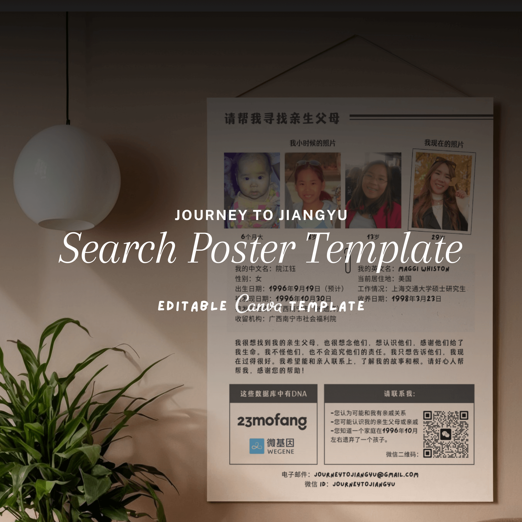
1. Photos that Tell a Story
The baby photo is the obvious one, especially if you have any from the time you were found or from the orphanage. But I also wanted to show how I’ve changed over time.
Too many photos can be overwhelming, but I found a good rhythm with four:
One baby photo
One from childhood (around elementary school age)
One from high school
One recent portrait
This mix helps tell a story, and it also helps avoid confusion. In China, some people might mistake a search poster for a missing child notice. Including your age and showing a clear progression from baby to adult helps make it obvious that you are the person in the photos, and that you're searching for your biological family, not your own child.
2. A Clear Ask
A lot of posters I came across included this phrase in bold:
请帮我寻找亲生父母
Please help me find my biological parents
It’s clear and direct, and it’s something Chinese readers will immediately understand. I used it as a headline at the top of my poster.
3. Essential Details in Bullet Form
Instead of writing one long paragraph with all my background info, I broke it into bullet points, similar to what you’d see on matchmaking flyers in China. It’s familiar, scannable, and quick to read.
Here are the fields I included on my poster:
Basic Information
Name (Chinese)
Name (English)
Gender
Date of Birth
Discovery Details
Date Found
Location Found
Institution / Orphanage
Adoption Information
Adoption Date
Current Residence
Occupation / Current Status
That’s the basic info people expect to see. I didn’t include anything about my health or how I’m doing now. Some people do, but I wanted to keep the focus on the search. Honestly, I question even adding the occupation section.
4. A Short Paragraph for Context
Below the bullet points, I added a short paragraph to explain why I’m searching and how much this means to me. It gave me space to share a little bit more emotion and offer a more personal connection to anyone reading it.
5. Contact Info and DNA Registries
At a minimum, your poster should include more than one way for someone to contact you. For me, I kept it to:
Email
WeChat QR code (this is a must — it's the easiest way for people in China to reach you)
That’s it. I didn’t add QQ or Weibo because I don’t actually use them. I only wanted contact options that I actually check.
If you’ve submitted your DNA to any of these registries, definitely include them on your poster:
23Mofang (23魔方)
WeGene
Baobeihuijia (宝贝回家)
I recommend including the logos and QR codes to your profiles if available. Just be sure your DNA account is complete and up to date and that the QR codes don’t expire.
6. No English
I know a lot of us adoptees are more comfortable writing in English, but when I designed my poster, I kept it fully in Chinese. The people I’m hoping to reach are Chinese. There just isn’t a need for English on the poster unless it’s for a dual-language purpose (like social media).
It also helps save space, which you’ll need for the layout.
7. Keep It Print-Friendly
If you’re printing at home or making a bunch of copies, design with ink in mind.
I avoided:
Colored backgrounds and gradients
Large graphics or illustrations
Too many colors
I stuck with dark text on a white background and used one accent color (a muted blue). The design still looks good in grayscale if it needs to be photocopied.
8. My Thoughts on Paper
Okay, I haven’t printed my posters yet, but I am picky about paper.
If I were printing, I’d go with something that’s matte, smooth, and just a little thicker than standard copy paper. Glossy finishes can be hard to read under sunlight, and thin paper tends to crumple or curl on bulletin boards.
What I’d recommend:
Matte finish
200–250gsm thickness
A4 or letter size (depending on your printer)
Even if you’re only printing a few copies, choosing the right paper makes it feel more intentional.
Final Thoughts
If you’re thinking about creating your own search poster, my advice is: start with what you can control. Don’t worry yet about where to post it or how people will respond. Just make something that feels true to you.
For me, starting with the design gave me something tangible to focus on. It gave me a way to take action, even when so many parts of the search feel uncertain.
And if you’re not sure where to begin, I made a template based on my own poster that you can check out on Etsy. Or feel free to take these ideas and make your own from scratch. The most important thing is that it feels true to you.
You don’t have to do it all at once. Just take the next step.